CASE STUDY 01 / AUDIO NETWORK
Search Redesign & Dark Mode
Search is central to our customers - it is the most visited area of the site, and three-quarters of our high-value accounts use search every day. Rebuilding the page has both benefits for our users and developers.
Competencies
UX, UI
Interaction Design
Motion Design
Role
Lead Product Designer
Observer in Research & User Testing


User Problem
External users: Search is the most popular area of our site, yet it had lost its appeal. It was slow to use and looked dated. Plus, many video editors working in dark editing suites had commented in research that our white-themed design was excessively bright.
Internal users: Our Search was stuck in old technology making it hard and slow for developers to work in.
Solution
While we didn't want to reinvent familiar search patterns that users were used to, we gave the Search page a visual refresh and implemented dark mode. We also optimised the experience on mobile, which was previously unusable.
Results
So far, we have seen over 30% of users switch to dark mode. We’ve also seen a large number of users use the copy to clipboard cue sheet information feature. In the first two months it was live, we saw 200 high-value customers using the copy-to-clipboard function 7600 times per month.
Introduction
Our search experience, built in 2017 with best practices of the time, served us well. Through research and investigation of newly available tech, it became evident that staying in our current application would leave us in a place much more complex and slower to develop than a modern framework offers. We believed that upgrading our search experience to our current 'Music App' standard would unlock value for both our users and us internally as a Product and Development team.
Our Clients
Our clients are video editors working in Television, Film, Advertising or for a Brand, such as Lego, Disney and the BBC. Their priority is finding the right track(s) for their project. They often face tight deadlines and work in low-light editing environments.
Pain Points
These pain points were observed in user testing (both internal & external):
-
Our Search tool was old and clunky. It didn't utilise the space on the page.
-
The page lacked colour, storytelling and inspiration.
-
Our software engineers found it old and slow to develop in.
-
Many of our video editor users work in dark editing suites and find our site very bright in comparison to other tools they were using such as video editing software. Being able to switch to a dark site was a feature that has been requested serval times in user testing.
-
The Search tool wasn't optimised for mobile and was incredibly hard to use on a smaller device.

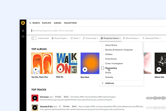
Original Search Page

New Search Page


Solution
Search results display our latest "Track Row" component. Our new track rows have many user improvements. They contains album artwork bringing more colour to the experience, plus a point of reference. The new track rows also have responsive behaviour for different screen sizes and environments
Moreover, they allocate space for waveforms, which assist in both music discovery and understanding relevance. And finally, they use consistent design patterns to create a coherent experience and better understanding of where to find key actions, such as marking a track as a "Favourite."
Alongside the enhanced track rows, users have the option to activate a "dark mode"—a crucial feature for those operating in dimly lit editing suites. We also refined the micro interactions and used motion design to make the tool feel more fluid, faster and more enjoyable to use. Plus, we optimised the experience for mobile for customers using our site on-the-go.
This page was developed using the latest technology to enhance development speed and capability, facilitate A/B testing, and generally allow for quicker iterations in the future.


Track Page
After searching for music and finding a relevant track, clients tend to click though to the Track Page. This is the most common user journey on our site. It shows content like mixes, stems and musical information about the track.
Pain Points
When clients use music in a production, they are required to fill in a “Cue Sheet”. We received feedback from clients that filling in cue sheets was a time-consuming process. They’d often have to look in a few different places to find the right information about a track and then copy and paste individual sections one by one into their cue sheet document.
The page was also very outdated, lacked colour and the information was disorganised (see below).

Original track page
Solution
To improve this experience, we wanted to make the page more inspiring. Searching for music for a project like a television show is an exciting task, and we wanted our user interface to reflect this and to show we're a premium music provider.
We added larger album artwork not only to bring more colour, but to also act as a point of reference (see below). We incorporated a blurred background (using the album cover) at the top of the page to further add colour.
We also created a side-panel section that includes all information about the track including cue sheet information.
-
Users can see all cue sheet information in one place in a cue sheet section.
-
Users can copy and paste individual sections or the entire cue sheet information in one go.
-
When users paste the cue sheet information into a document, table or excel spreadsheet, the information is automatically formatted correctly, making it a smoother process.

New track page
Results
We’ve seen a large number of users use this new feature so far. In the first two months it has been live, we have seen 200 high-value customers using the copy-to-clipboard function 7600 times per month.
Next Iteration

In user testing, clients commented that they want to see track information from the Search page to reduce the back-and-forth between the Search Page and Track Pages. To improve this experience, I designed a track “tray” that can be accessed from any track row across the site. This will open over the top of the page and will contain the most important track information such as cue sheet information and lyrics (see below).
